
Netflix is rapidly becoming the Service We Hate But Can’t Live Without. I’ve previously documented my complaint about the woeful lack of streaming movies, compared to the company’s DVD offerings, but grudgingly admit that there are some external causal factors at play.
However, the latest incarnation of Netflix’s iOS app was apparently built without regard for logic, common sense, or – worst of all – consideration for its users.
Granted, the application is very easy to use, with a clean interface and logical navigation. Netflix improved the app by including movie titles alongside every movie poster icon; in the previous version, you had to be able to read the title or recognize the poster to figure out the identity without actually clicking on it.
Here are a couple of screenshot from the new app. The first shows the typical movie listing for a genre; in this case, I chose the Sci-Fi & Fantasy genre.
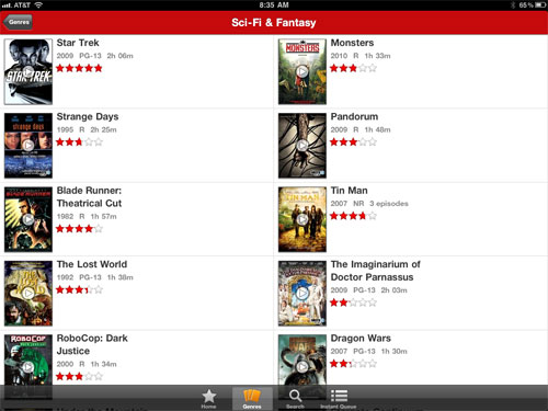
It’s a straightforward listing of the important facts about each movie: title, release year, MPAA rating, running time, and cumulative Netflix viewer rating (a subjective indication of quality or at least popularity). Click on the icon to watch the movie; click on the title to get a little more information about the movie. Here’s the information screen for Blade Runner.
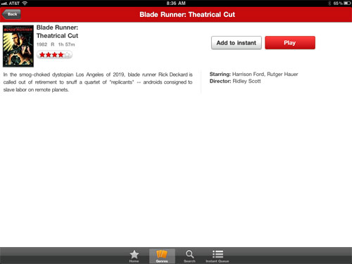
On this page you get a very brief plot summary, the primary actors, the director, and options to either play the movie or add it to your queue. Again, very clean and straightforward.
Well, for many of us, it’s too clean and straightforward, as the simplicity was achieved in part by eliminating some valuable features from the previous version of the app. Netflix has eliminated eight genres in the app vs. its website, and has dropped the sub-genres in the app, which were useful for narrowing one’s choices. For example, in the previous app’s Action & Adventure genre, there were 17 sub-genres (the same ones that are still on the website), making it much easier to find something of interest. In the new app, you just have one choice.
The earlier version also had a longer plot summary as well as access to viewer and critic reviews of the movie, and links to similar movies. Or, more accurately, it mirrored the Netflix website’s content, shown below:
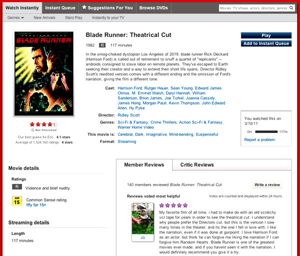
Quite a difference. Sure, the web page is busy, and not everyone is interested in all the features, but I’m not sure why Netflix decided its app users didn’t need any of them.
Reasonable people may differ on these issues, but there’s one area where Netflix has crippled the new app that represents an almost inconceivable backwards step: it truncates the list of available movie titles for a given genre at 100. This means that if you’re browsing through the list of, say, available Sci-Fi/Fantasy films, you’ll not see 75 movies in that list. If you’re looking at Independent films, you’ll miss 20 titles. And if you’re browsing through the Action/Adventure genre, the list will omit almost 500 movies. (All of these numbers are derived by comparing the total number of streaming titles listed on the website in each genre, vs the 100-count lists in the app.)
That’s not to say that the movies aren’t available for streaming via the app; they’re still there, but you have to know about them, and you can only find them by using the Search feature. That’s about as non-user-friendly as you can get.
It’s bad enough that Netflix provides only a tiny fraction of its movie inventory for streaming, but it add insult to injury by making it significantly more difficult to find all the streaming titles via the app that’s commonly used for the streaming.
I’m not the only person unhappy about the dumbing down of the Netflix app. However, I was apparently the only person who noticed the shortening of the genre listings, going by the comments in the article linked above. I’m either perceptive or obsessive, but if I’m paying for a service, I expect it to get better over time, not worse. Netflix, are you listening?
Discover more from The Fire Ant Gazette
Subscribe to get the latest posts sent to your email.