I noticed an article in the Wall Street Journal a couple of days ago chronicling the continuing decline in newspaper circulation.
The newspaper industry’s twice-yearly report showed weekday circulation at the more than 700 newspapers with audited data was down 2.6% compared with the same period a year ago. The report, issued by the Audit Bureau of Circulations, follows a 1.9% decline during the previous reporting period ended March 30. The circulation figures, which are used to set advertising rates, are scrutinized by advertisers and Wall Street.
Now, I’m always loathe to compare blogs to the MSM, but I do think it’s wise to stay on top of trends like this and understand the implications. Therefore, I’ve spent a lot of time recently getting a handle on the preferences of the Gazette’s readership to ensure that it doesn’t suffer the same embarrassing fate.
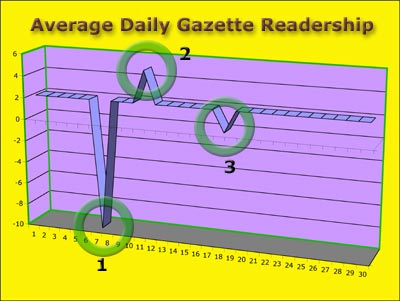
The second most frequent question* I get is along the lines of “how do A-list bloggers figure out what to write about?” Of course, I don’t even know any A-listers, much less know how they decide what to write; I just figure they have staffs to do that for them, while they’re taking power lunches. But I do know what my readership responds to, and the following chart is amazingly illuminating.

This graph tracks average daily readership over a typical month. You’ll notice that it remains fairly constant, but three spikes are obvious. A careful analysis reveals that these spikes are related to specific post content, to wit:
- A post about politics
- A post about baby squirrels
- A post about the politics of baby squirrels
Pretty telling, huh? In the case of #1, the negative readership numbers seems to indicate that not only did people stop reading the Gazette, but they shut down their computers and sat on the back porch, moping.
I believe the lessons of this graph are clear, and I’ll try to keep them in mind for future posts.
By the way, this graph also illustrates another significant — albeit unrelated — point: the accuracy of the data on which a graph is based is indirectly proportional to the number of colors, drop-shadows, 3-D and bevel effects used therein.
*The most frequently asked question is “are you still on your meds?” As if that would make any difference.
Discover more from The Fire Ant Gazette
Subscribe to get the latest posts sent to your email.

Here’s my vote for another baby squirrel post. Oh, and I have pictures for this also. I’ll send them along via e-mail and you can just drop your check in the mail. 😉
BTW, I do not see a separate category for baby squirrel stories. Do you file them under politics or religion?
Two insights here and a design question:
1. If you must post about politics, throw in a baby squirrel, two would be even better.
2. Try comparing this particular month to another particular month I have in mind, setting each index around the average for that month. I hypothesize you will find that posting about baby squirrels helping you fold fitted bed sheets will catapult you right to the A list.
Design question: how come the spikes don’t link to the posts in question?
Jim, you’re taking this much too seriously. Are you still on your meds?
Ahh, yes, of course. Frankly, I’m getting a little tired of the stories about rodents on Wall Street.
😉
Serious? Who, me? Meds? What meds?
Baby squirrels are cute.
Those nutty readers
Traffic at this site is back up over the 1000-a-day mark this week, for no reason I can fathom. Unless it’s because the regulars (whoever they may be) know it’s…
Christopher, I agree with you in general, but there’s a much darker and seamier side that has yet remained relatively unpublicized. I’m not sure whether I’m brave enough to tackle it…
“You’re braver than you believe, stronger than you seem and smarter than you think.”