Many of you probably received the following letter, or one very similar to it:
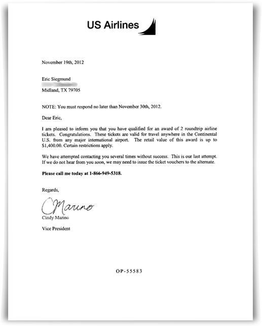
Yours probably had a more legible address; I’ve blurred mine to foil people who don’t have access to phone books or the Internet. Clever, huh?
Now, this is obviously a scam, which you can confirm for yourself simply by Googling “US Airlines scam” and visiting any of the more than 30,000 results. There are various explanations for what the scammers are trying to accomplish; the most credible one seems to be that they’re harvesting phone numbers for re-sale, and by calling in and giving them the number at the bottom of the page, they can correlate your name to your phone number and that makes the data more valuable. (Never mind that earlier thing about phone books and/or the Internet.)
These things are somewhat annoying, although unless I’m missing something, this ranks about a 2 on the Scam Scale©, where a 10 is the loss of your life savings and the involuntary donation of several key body organs, and 1 is the equivalent of listening to a Nancy Pelosi speech. But the truly horrid thing about this particular approach is just how awful their design skills are.
I mean, just look at that letterhead! A three-year-old could design a more attractive logo, not to mention the poor judgment of an airline using a symbol that evokes a crashing jet. And the fact that the logotype is slightly off center on the page is worse than fingernails on a blackboard (or, for those born after the year 1995, a Nancy Pelosi speech). It hurts my head just to look at the letter.
So, here’s my message to future would-be scammers: at least take the time to steal some good design ideas from the legitimate enterprises whose domains you’re attempting to master. Some of us will thank you for it.
And for an excruciatingly detailed analysis of all the other faux pas in this letter, jump over to this page. The author makes me look as focused as The Dude.
Discover more from The Fire Ant Gazette
Subscribe to get the latest posts sent to your email.