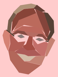
So, I ran across this cool tutorial (via Twitter) explaining how to create a polygon portrait poster design in three easy steps. I have no idea what a “polygon portrait poster” is, but the result was interesting and it seemed to be a process that meshed well with my artistic aptitude (read: stupid simple), so I decided to fire up Photoshop and try it out.
You can jump on the link to see the entire tutorial, but what struck me as a stroke of brilliance was the suggestion of using the Eyedropper tool to select a color that was dominant on the portion of the source photo within the bounds of each polygon. This was a revelation to a mostly-colorblind non-artiste like me, because it basically removed any responsibility for having to make decisions regarding color.
I think this technique might be more suitable for a photo that is dark and brooding (again, see the actual tutorial), but I don’t think I’m capable of dark and brooding. The closest I can come is snark and looming. I do think the result would be better using a photo with side lighting, so that the shadows are bit more dramatic.
Anyway, here’s the result of my efforts.


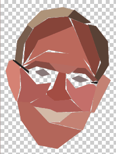
I can pass along one tip if you want to try this. The key is to not worry about being too precise with the polygons. Don’t worry if you have some gaps. In the tutorial, all the polygons were perfectly aligned, edge-to-edge, but that might be overkill. In fact, here’s what my first pass looked like:

This is a screenshot from Photoshop; the checkerboard background shows where there is no color, and it clearly shows where I was rather cavalier in my approach to drawing the polygons. I addressed this issue simply by creating a background layer and filling it with color to fill in the “cracks.” I think this approach adds a bit of character to the image, although I could just be delusional.
Discover more from The Fire Ant Gazette
Subscribe to get the latest posts sent to your email.
