
Editor’s Note: The following post is in flagrant violation of this blog’s stated principle of Content Free®, uh…content.
Alert Gazette readers will remember that about a week ago I posted something about radio.garden, a website and app that provides links to radio stations around the world. This site piqued my interest for several reasons, not the least of which is a fascination with maps, as the interface for radio.garden is simply a globe of Planet Earth.
For a relatively short period of my career, I worked as a geographic information specialist for an oil company, despite the not inconsiderable drawback of having absolutely no experience in that field (the company was really hard-up for employees; my availability was apparently more important than my ability). The job was as interesting as it was challenging, and it was there that I was introduced to the concept of map projections.
A map projection is a means of transforming the surface of the globe (which is, of course, a 3D model) onto the flat, 2D surface of a map. (Now, if you’re a Flat Earther, you can ignore the rest of this portion of the post…or get a good laugh from what you’ll judge to be its inherent ridiculousness[1].) For about two millennia, people have been trying to work out the best way to do this transformation. It’s hard, because every flavor of projection — and there are more than 200 “well-documented” versions — distorts some aspect of the globe. Thus, any given projection is a compromise…certain properties of the globe are distorted in order to accurately represent other properties.
Why is this a big deal? The answer is more complicated than I want to address here, but if you’re interested, you can jump over to this portion of the post I linked to above to get a general idea.
A projection is sometimes chosen (or promoted) because of national pride, or even continental pride, in the case of Africa. And this is where we get to the real reason for this post…sorry about the lengthy meandering introduction.
The most widely-used map projection is the Mercator projection, and it was created in the 16th century and eventually adopted because of its accuracy and usefulness for seafaring navigation. But it has the drawback of inflating the size of land masses the farther they are from the equator. Because of this, the island of Greenland appears larger than the entire African continent. And just look at the awe-inspiring land mass known as Antarctica.
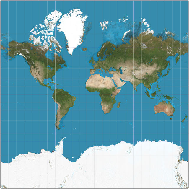
Image credit: Daniel R. Strebe – own work [CC BY-SA 3.0]
Africa is fed up to here, and has possibly been since 1569, with this insult and is attempting to do something about it. According to this article in the New York Times (possibly/probably behind a paywall), the African Union (“A.U.”) has endorsed a campaign to convince other organizations/countries/continents/map geeks to start using the Equal Earth projection.
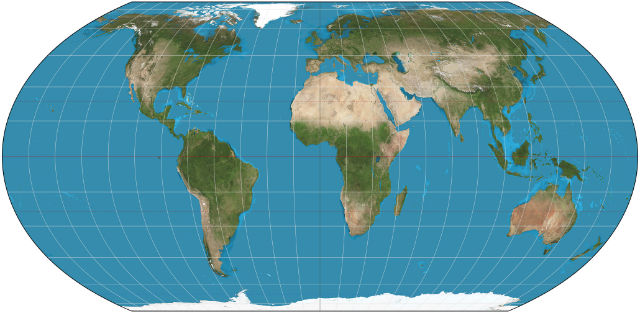
Image credit: By Daniel R. Strebe – own work, [CC BY-SA 4.0]
This projection, according to the A.U., restores the African continent to its proper dimensions in relation to the rest of the world, and especially Greenland. And it has a point. Greenland’s land mass covers less than a million square miles, while Africa has an area of almost 12 million square miles. Europe is only 4 million square miles, but in the Mercator projection it appears only a bit smaller than Africa. Africa’s geographic inferiority complex is based in reality.
We will choose to overlook the outrageously enlarged status of Antarctica, which is a distortion common to almost every other map projection. The exception is one called a polar azimuthal projection which is used to accurately depict the size of either locations within the Arctic Circle, or the continent of Antarctica, relative to the world’s other land masses. A variation called the Authagraph Projection is actually based on an Equal Earth projection, albeit in a somewhat unorthodox layout. [2]
Of course, the Equal Earth projection is not without its own distortions. While it does more accurately display the size (i.e. area) of land masses, it distorts their shapes by stretching in a north-south direction those located in the mid-latitudes, and compressing in the same direction the ones nearer the poles.
So, is this a distinction without a difference? Not really, at least not for this specific intended purpose. Global maps can be used for varying purposes, many of which are for non-detailed views of relative locations, distances, and…yes…sizes. If the A.U. feels that the Equal Earth projection helps restore the continent to its right size and thereby enhances its status and position of global influence, so be it. But I doubt that anyone would argue that this is anywhere near close to the top of list of issues that face Africa. Even some of the organizations affiliated with the A.U. appear to be placing their emphases on those other issues; the New York Times article linked above reported that “several” of those agencies still use a Mercator map on their websites (although it doesn’t list any specific agencies).
Perhaps this is a tempest in a teapot, but as a former less-than-skilled cartographer, I find the whole situation pretty interesting.
Footnotes of no particular importance
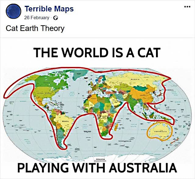
[1] I’m a bit skeptical of the scientific basis for the Flat Earth theory, but I’ll grant some measure of accuracy to the Cat Earth theory, as proven by the following map (which, btw, appears to use the Equal Earth projection). [Return]
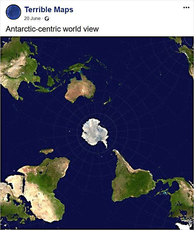
[2] If you’re interested in seeing a more accurate depiction of the size of Antarctica, the following map shows how the continent and the rest of the world might look from space, assuming of course if the world was flattened. [Cue, once more, the Flat Earthers] [Return]
Discover more from The Fire Ant Gazette
Subscribe to get the latest posts sent to your email.
We studied three of the various map projections this year in history. I found it fascinating. Youngest boy is now an advocate for carrying around mini globes that have some sort of magical or technological ability to zoom as needed. He doesn’t care that it feels impractical. He’s all about accuracy.