The proposed 58-story building in downtown Midland has been a topic of active discussion, as you might imagine. It will be more than twice as tall as the next tallest structure in Midland, and much of the discussion centers around the feeling that it will simply look out of place (although I’m expressing that sentiment in much more diplomatic terms than most of the commenters on Facebook). The next most frequent argument against it is that it’s basically just another “Tower of Babel” being built to show off how hoity-toity Midland has become. Some people have too much time on their hands, in my opinion.
For the record, while I remain skeptical that it will actually get built, I’m all for it, especially once I learned it will feature a ballroom.
Anyway, disregarding any arguments about the aesthetics of the project or how it fits in with its surroundings or whether God feels threatened by our architectural plans, I wonder if the decision-makers have completely thought through the implications of allowing this thing to go forward. And, of course, I’m referring to the impact on the city’s logo (you anticipated this, right?).
We’re already proud enough of our skyline to feature it on the city’s logo:
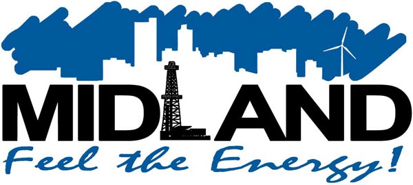
It’s a nice enough logo, as municipal designs go. And it’s been recently updated to include wind turbines, a nice nod toward its contribution of .00032% of the overall economic activity of our town. At least it’s not green. It got a pleasant proportionality to it. But that’s gotta change once the new tower is in place:
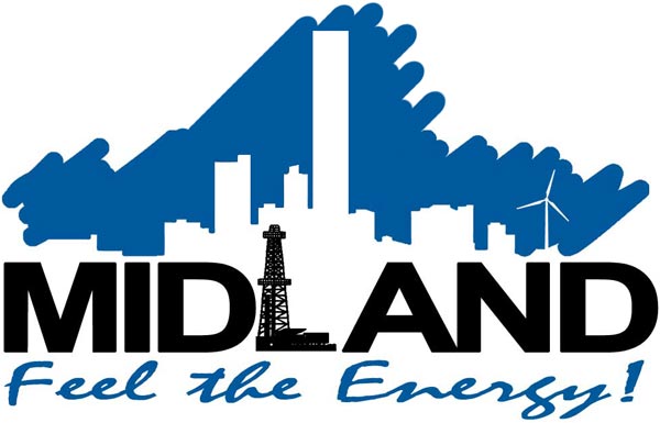
Now, I’m not a logo designer, but this just doesn’t look right to me. But how can you neglect what will surely become the defining characteristic of our skyline?
The thing is, whether you like the new design or not, it’s going to be a huge undertaking to update logos throughout the city, because they appear on pretty much everything of a muni-persuasion…for example, trucks:
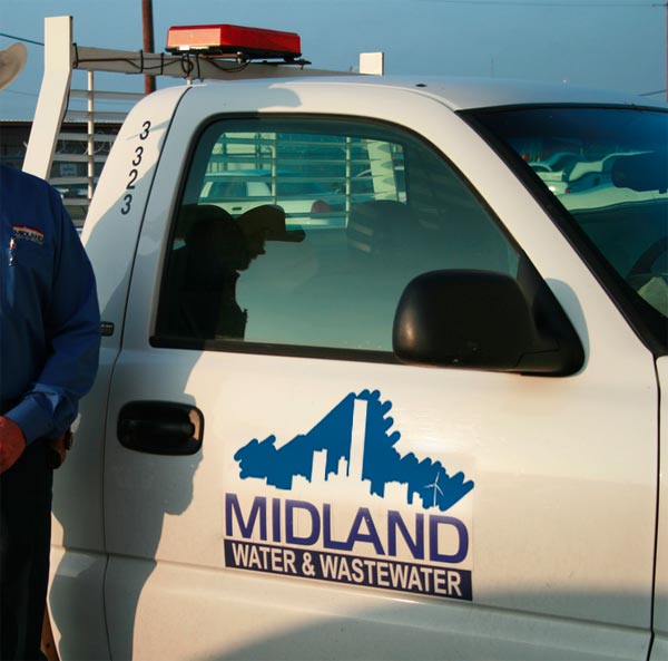
Well, frankly, while I envisioned something really goofy, in actuality I don’t think that looks too bad, so apart from the time and trouble to update it, maybe we’re OK there (although if we put it on any sedans, it might creep up onto the car windows and that will look a little funky).
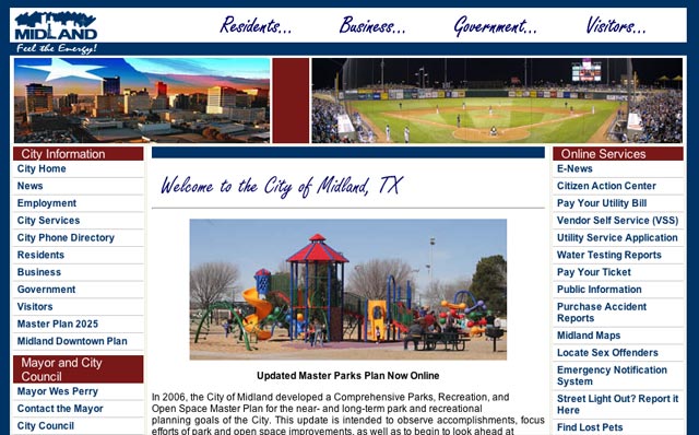
But I’ll bet no one has studied the impact on the city’s website. Here’s what the home page looks like today:
And here’s what it might have to look like post-TowerOfBabel:
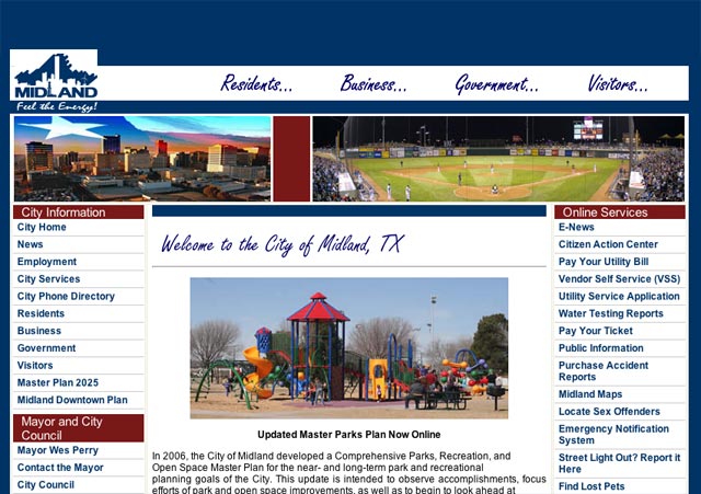
Yes. I’m sure you’re just as appalled as I am.
Here’s the thing. Everyone gets giddy over the prospect of a couple hundred million dollars being spent to double the downtown office space (and tax base), but they rarely temper their enthusiasm with the reality of the details. I think that before anyone signs on the dotted line, they need to ask themselves if they’re truly ready to step up and do what it takes to address the burning logo question. I am, of course, available for consultation, and at a rate that I think will be highly competitive with any city sporting its own Tower of Babel.
Discover more from The Fire Ant Gazette
Subscribe to get the latest posts sent to your email.
Love it!